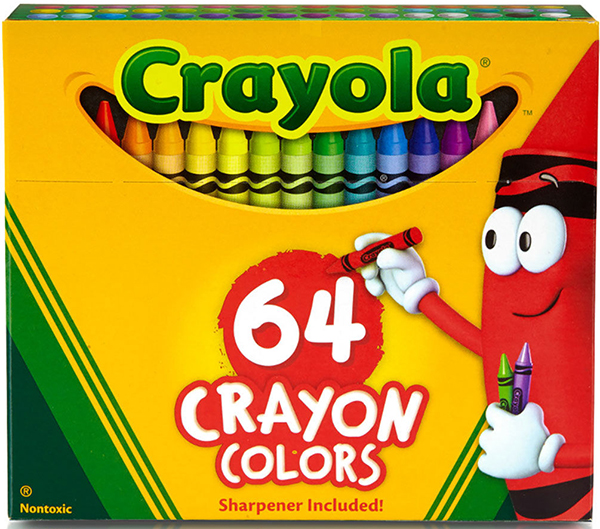
I remember lifting the crisp cardboard, yellow and green, rectangular box top and thrilling to every Crayola Crayon color name:
The Exotics like- Prussian Blue, Aquamarine, Sepia, Mulberry, Mahogany, Thistle, Terracotta, Cornflower, and Periwinkle. Or the comfortingly descriptive: Lemon yellow, Forest Green, Orange, Plum, Sky Blue, Grey, Black, and the exquisitely subtle White.
Then there were the angst-driven Crayola Crayon color choices: Blue Violet or Violet Blue? Red Violet or Violet Red? This kind of power to choose the precise shade and hue, of that elusive moment you want to capture in Art, has always been the stuff of dreams.
Can Spring-Green best capture the brilliant sunlight even if it is a pine tree? Are carnations always Carnation Pink? That seems unduly limiting. What color is an Orchid? There are millions of orchids loose in the world. I don’t think one color crayon can possibly reflect them all. That’s how I learned about blending hues and shading.
I was most intrigued by the shiny, metallic minerals. A Copper crayon that was obviously real copper, right? And precious Silver and Gold? I used my metallic crayon coinage sparingly.
Santa knew if I had squandered my last year’s crayons. The tiny stubs must last until Next Christmas so I could look for a brand new Crayola Crayon 64 box with a ‘built-in sharpener in my next year’s stocking.
HOME
All Art Work and written content
copyright Mary Lee Mattison
Leave a Reply